Freelance Branding
Lead designer; art direction and branding identity
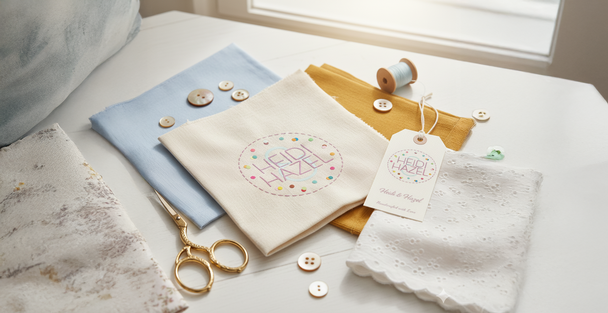
Heidi & Hazel is an up-coming start-up boutique, custom clothing and apparel brand with a target audience of mothers and their daughters. Named after the creator’s grandmother and daughter, I was employed to create a logo and brand identity that had a feminine and playful, yet homely feel to it.
The client’s grandmother was a proficient seamstress and the client wanted this to be reflected in the design. Taking inspiration from this, and the fabrics the client used in their dresses, a logo was designed was reminiscent of stitching patterns, with a spotted fabric texture.


The colour palette was an important element of the logo and branding identity of Heidi & Hazel.
A strict monochromatic primary and secondary colour palette was chosen for the logo, with a wide range complementary highlight colours chosen for the spot pattern. This was to give freedom to the client, who wanted the option to use the logo and pattern for future, more in-depth design elements, e.g. lettering heads and website design.


Logo
I designed the logo to be reminiscent of stitching patterns,
with a spotted fabric texture.

The logos exclusion zone
is 15% of the total logo.
Equal to the width of H
(marked as x in
the diagram).


