One Creative
Design Agency
At One Creative my main responsibility was looking after
The Women’s College, alongside other clients such as St. Ives
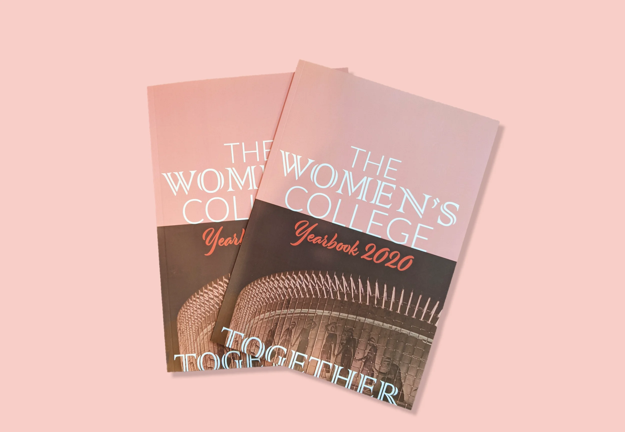
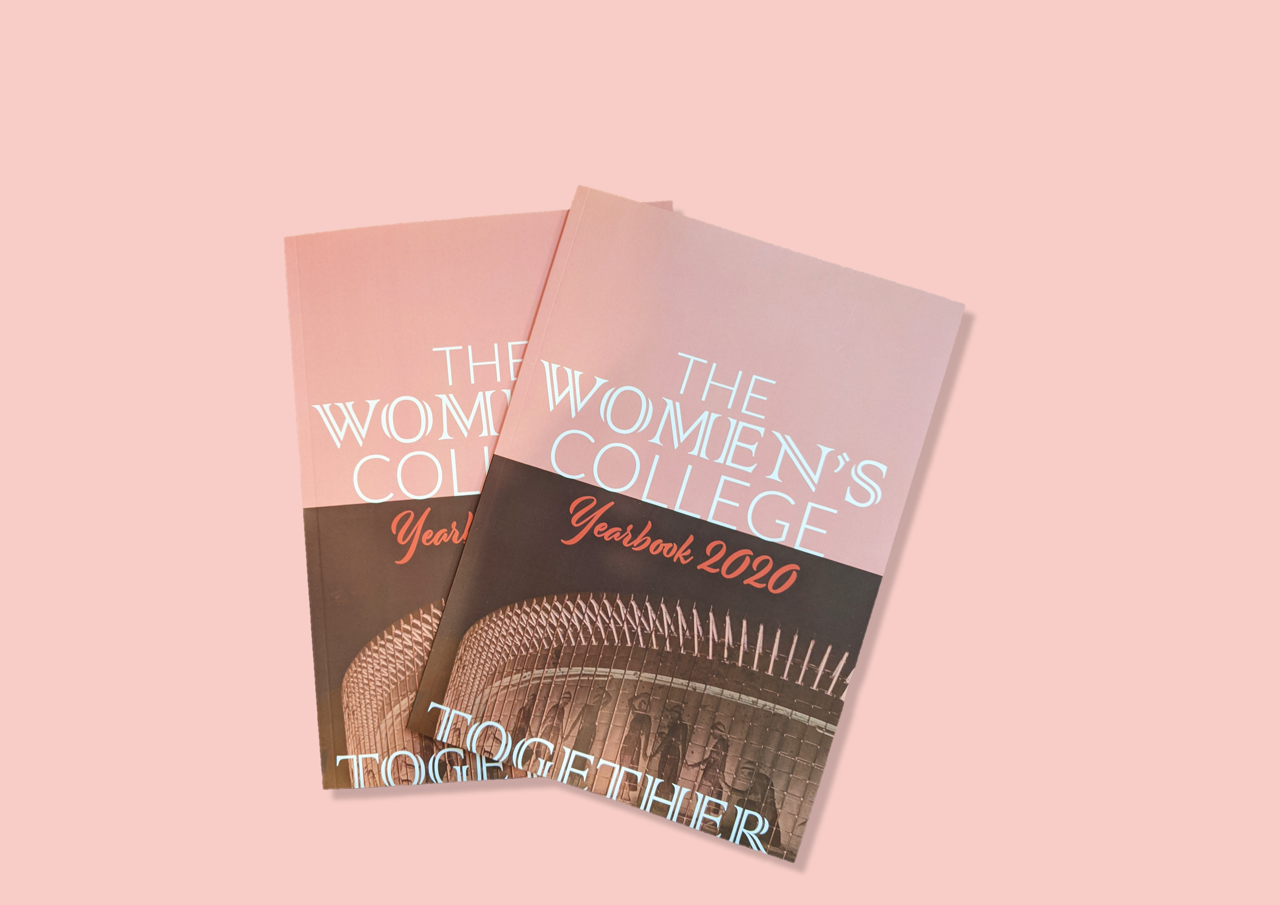
Village and Planet Fitness The Women’s college is a respected
academic institution dedicated to advancing women's roles.
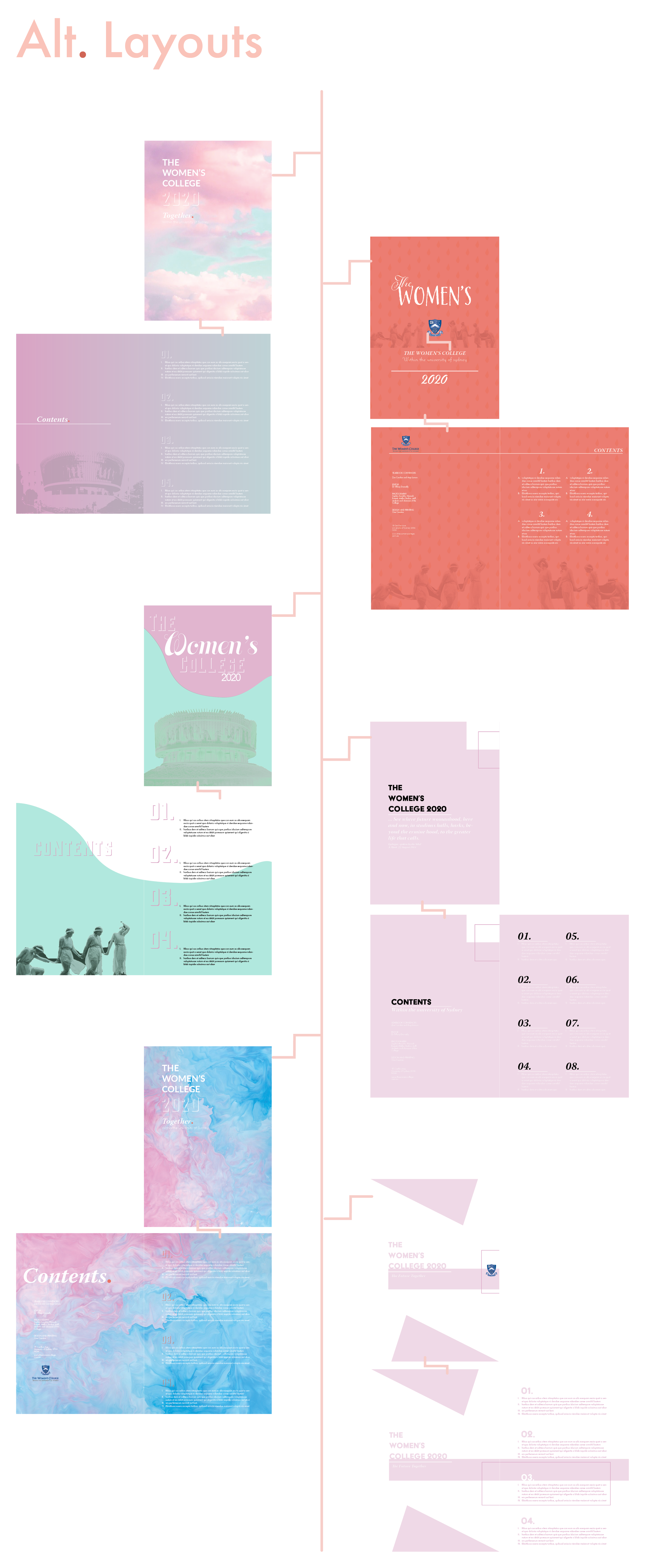
The college envisioned a yearbook that embodied both its
traditional values and modern aspirations.
This duality was reflected in the design preferences of students,
who favored colorful designs, while the administrative staff
preferred a traditional aesthetic. Through thorough research and
client communication, I developed an art direction that honors the
college's historic architecture. The façade, which resembles a
Greek pediment, features a classical procession of women in copper.
By combining this distinctive element with a vibrant color palette
and thoughtful layout, I created an elegant and unique yearbook.
SCOPE
BRANDING
LAYOUT & PUBLICATION DESIGN
PRODUCTION DESIGN & VINYL CUTTING
WEBSITE DESIGN & UPDATES
COLLABORATORS
THE BOARD OF THE WOMEN’S COLLEGE
THE UNIVERSITY OF SYDNEY
PLANET FITNESS
ST. IVES VILLAGE
COPYWRITERS

Alternative, Modern, Clean.
AppealING to the ALL GENERATIONS.
Dream it
〰️
Dream it 〰️
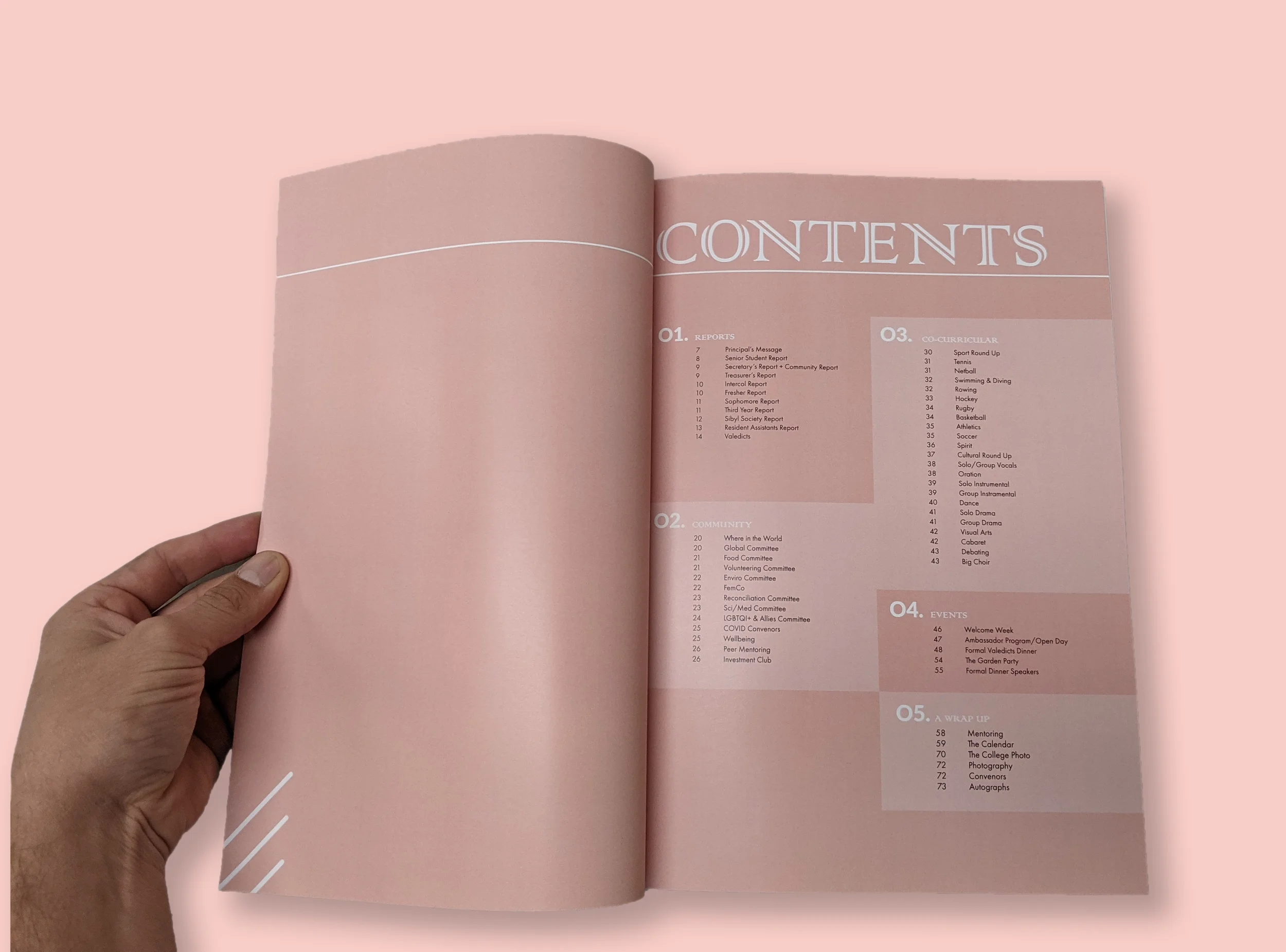
A blend of traditional typography was used in conjunction with a modern layout to achieve an outcome that appeals to all age groups.
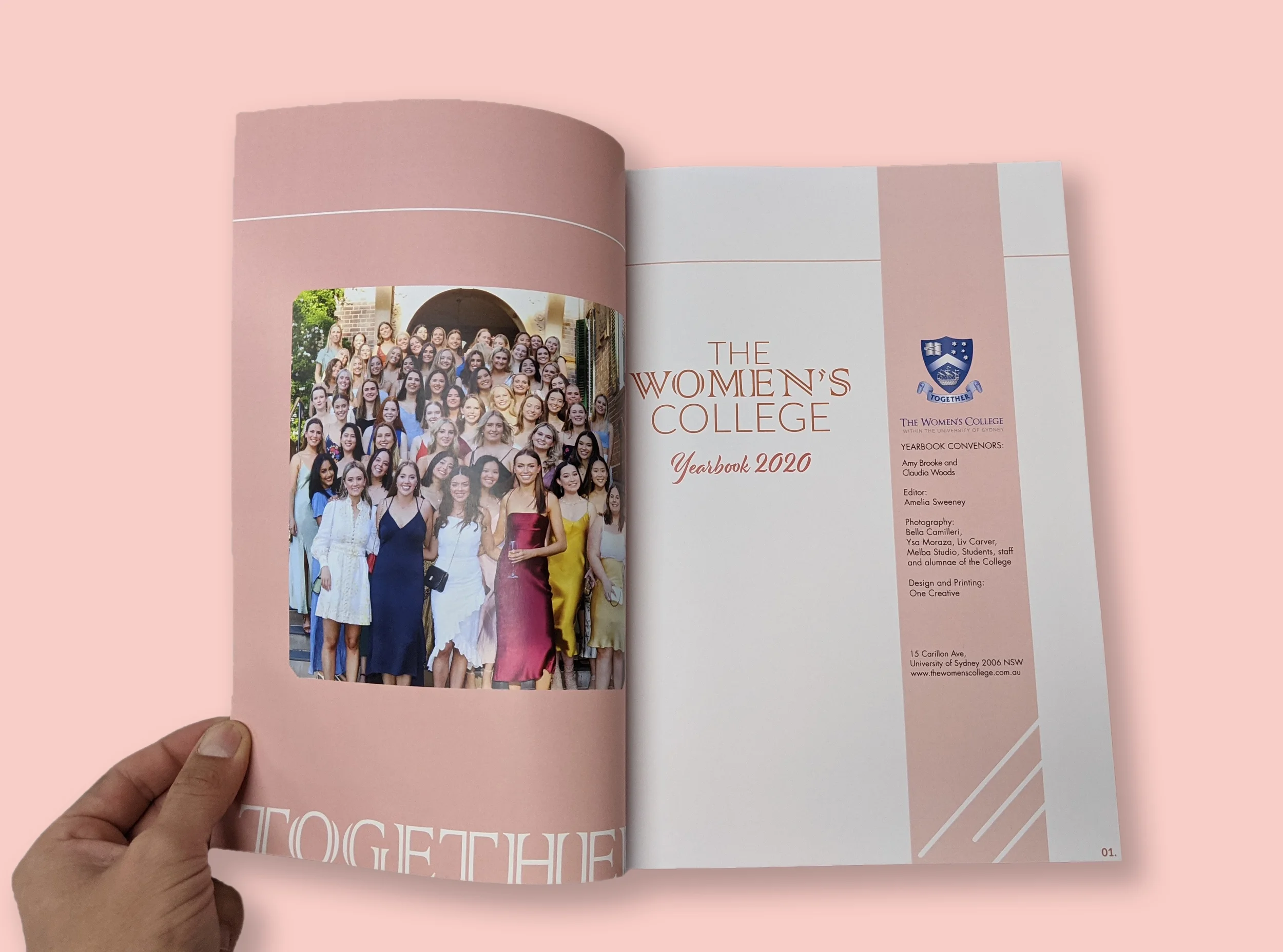
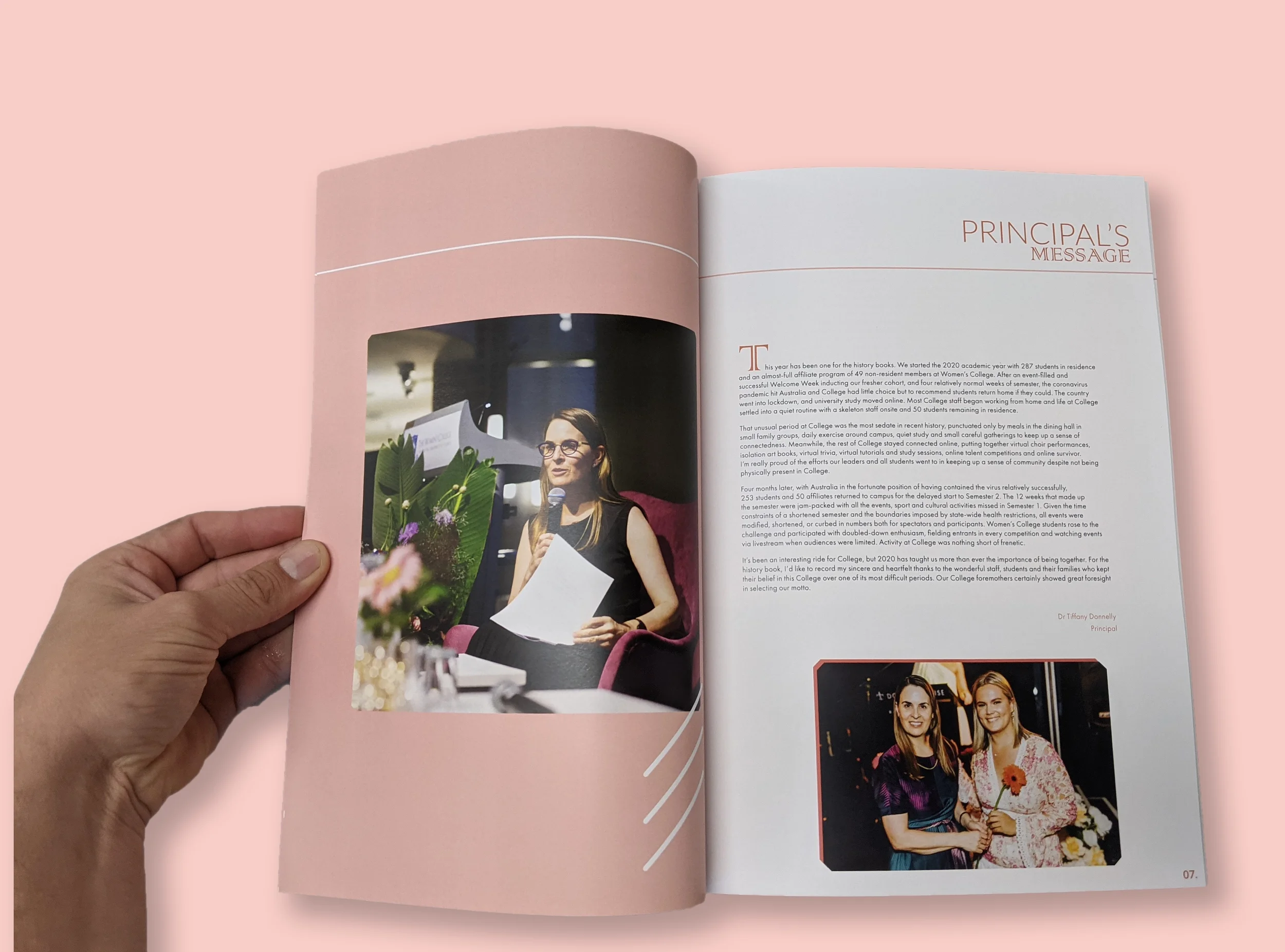
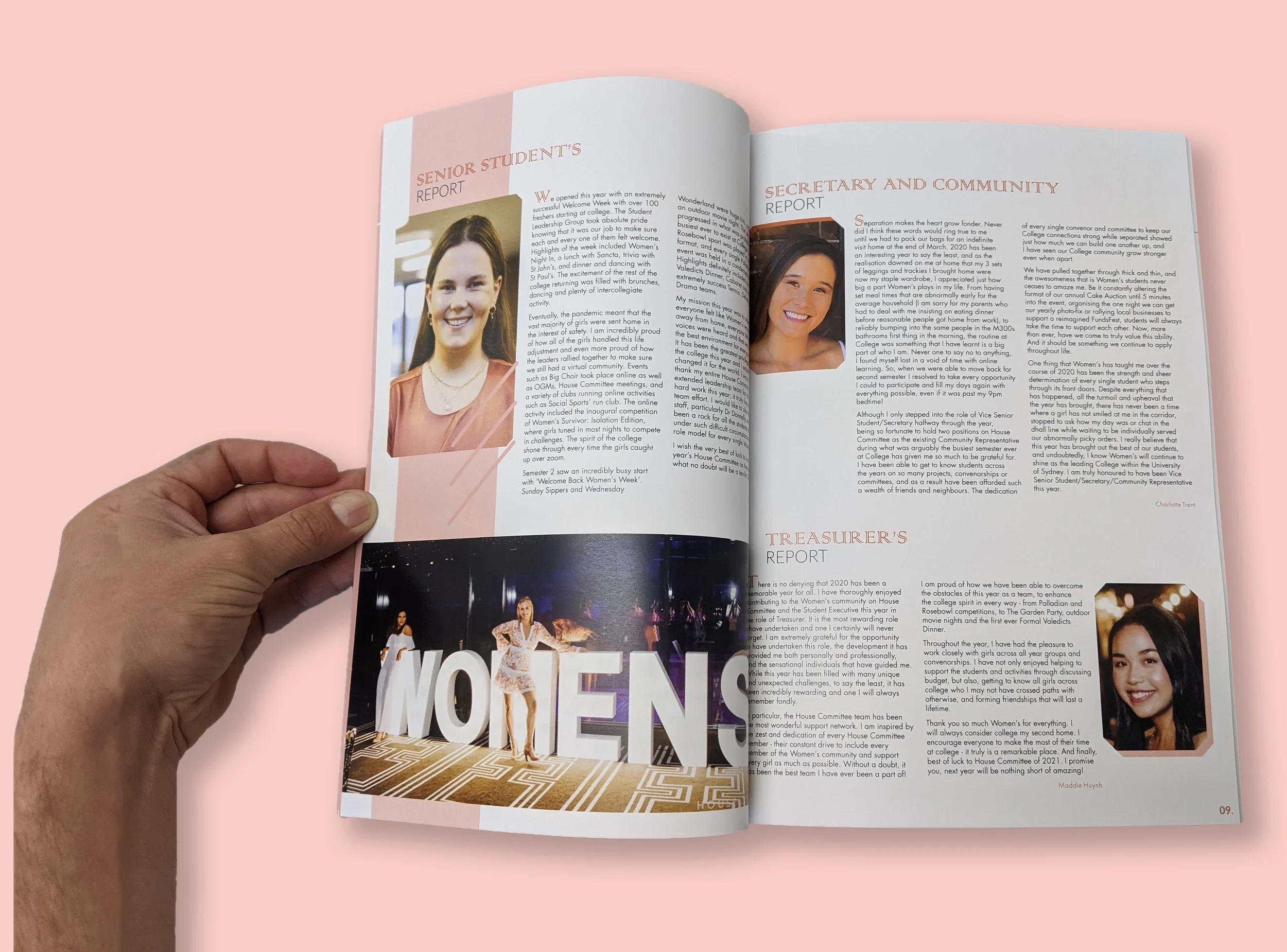
This book celebrates the outstanding contributions of women, A detailed grid layout was created to showcase the photos prominently.
We explored various design styles collaboratively, generating alternative ideas that showcased the unique perspectives of the women involved. Each meeting allowed us to discuss and sample different aesthetics, themes, and functionalities. This process fostered creativity and refined our vision, leading us to a cohesive design that resonateD with all stakeholders.
The result is a thoughtfully crafted design that embodies innovation and inclusivity, reflecting the participants' contributions.
A millennial pink color palette was implemented to achieve a feminine aesthetic.
a clean and sophisticated appearance WAS ESTABLISHED.
Dream it
〰️
Dream it 〰️
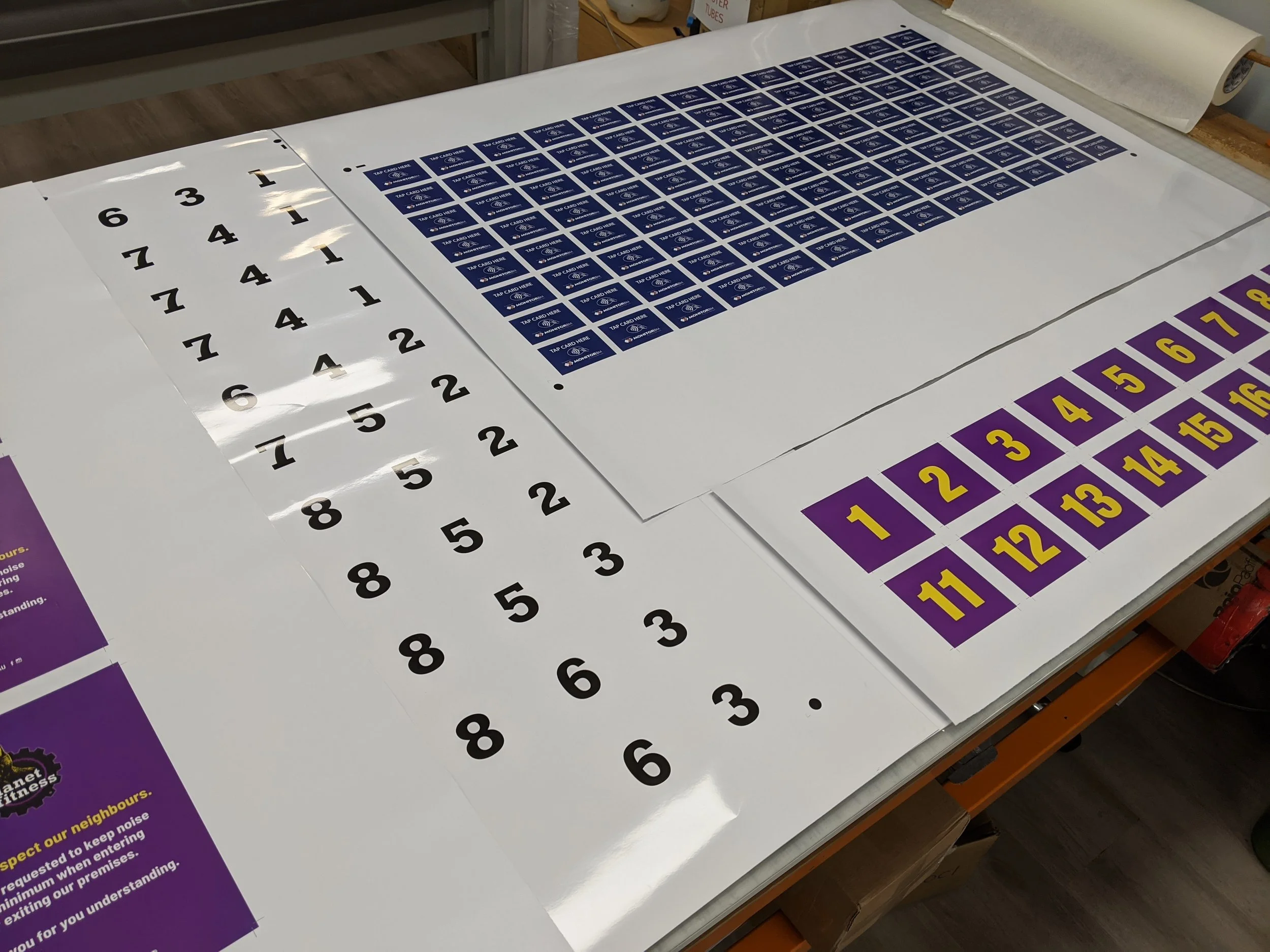
Production design
Layouts and branding were designed and produced for various vinyl advertisements for
companies across the Sydney region.
-
Led all aspects of production design, ensuring seamless collaboration among team members and external partners.
Managed operations meticulously, maintaining a clear flow of communication to guarantee that every element—from digital design to print, cutting, and installation—was executed with precision and accuracy.
My focus on detail and commitment to quality standards ensured that every project was delivered on time and met the highest expectations.
-
Honed my skills in vinyl cutting, print production, and the application of branded materials.
By experimenting with different printing methods and finishing touches, I developed an eye for quality and precision. Engaging with industry professionals and attending workshops further expanded my knowledge, allowing me to stay ahead of trends and technologies.
Today, I am proud to be recognised as an expert in creating impactful printed materials that effectively convey brand messages and enhance visibility.
-
Effective team management played a crucial role in the design production at our creative agency.
By fostering an environment of open communication and collaboration, I ensured that each team member's strengths were recognised and utilised. This streamlined workflow and enhanced creativity and innovation.
Clear expectations and regular feedback kept the team aligned with project goals, minimising misunderstandings and maximising productivity.
Ultimately, strong team management led to the successful delivery of projects that met client needs and exceeded expectations, reinforcing our reputation in the industry.