WHITELEY MEDICAL
& VICTOR SPORTS
The merger between Victor Sports and Whiteley Medical required a
comprehensive rebranding initiative and a targeted marketing campaign.
This project successfully enhanced brand recognition and optimized the
user experience for their diverse audience. Key elements of the strategy
included the modernization of both retail and wholesale websites, as well
as the redesign of packaging and branding materials.
A multifaceted (360) marketing campaign was developed, featuring
electronic direct mail (EDM), targeted mailers, and radio and television
advertisements. This approach aimed to position Victor prominently
within the sporting community, including partnerships with well-known
sports clubs, engaging local teams, the “Weekend Warriors,” and medical
professionals, as well as national league teams and elite athletes.
The new branding was crafted to be both distinct and direct, effectively
establishing Victor as the preferred supplier in various sectors. As a result,
the rebranding initiative not only strengthened the company's market
presence but also solidified its reputation as a leader in the industry.
SCOPE
ART DIRECTION
BRANDING
PACKAGING
PRODUCTION DESIGN
WEBSITE DESIGN & UPDATES
APAREL & PRODUCT DESIGN
DIGITAL & TV ADVERTISMENTS
EDMS
PHOTOGRAPHY
PUBLICATIONS
COLLATERAL DESIGNS
TEAM MANAGMENT & COLLABERATION
INFRASTRUCTURE BUILDING
ASSEST MANAGEMENT

COLLABORATORS
INTERNAL MARKETING TEAM
INTERNAL COPY TEAM
DISTRIBUTORS ASIA, OCEANIC, UK & USA
UK OFFICE & NZ OFFICE


40% Increase on victor product sales since the launch OF THE new branding, Packaging and marketing campaigns from 2021.
Analysis of 2022 sales revealed the new strategy brought in an additional $350,000 OF revenue.

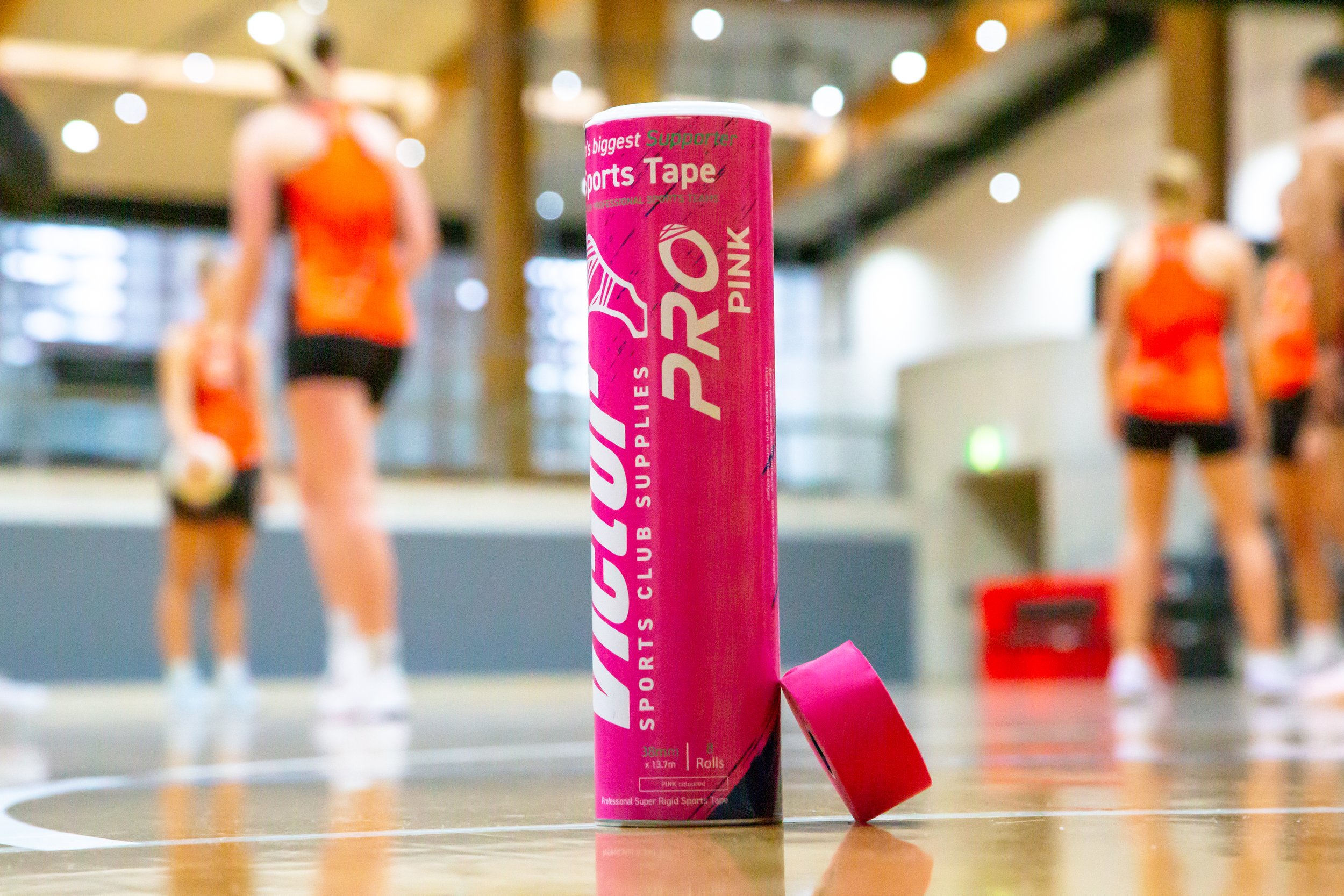
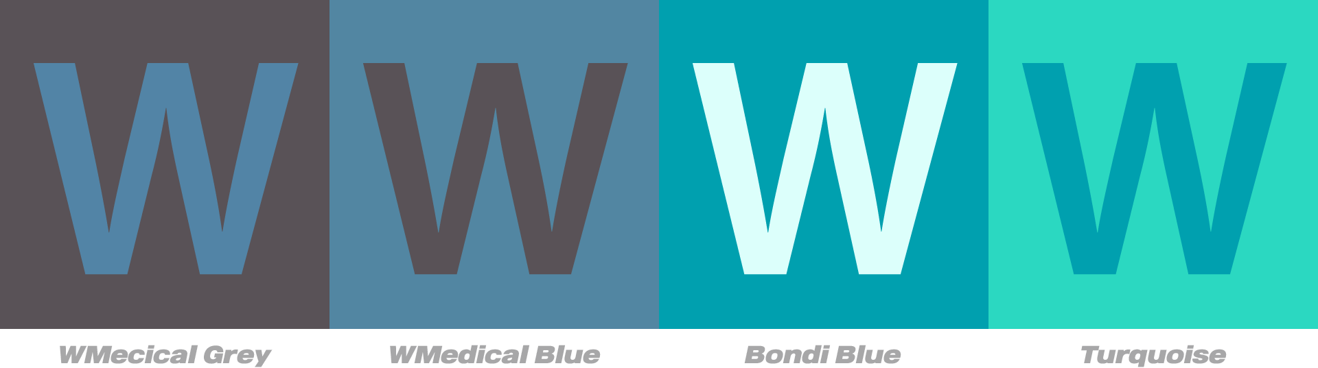
SPorts & MEDical
Packaging
-
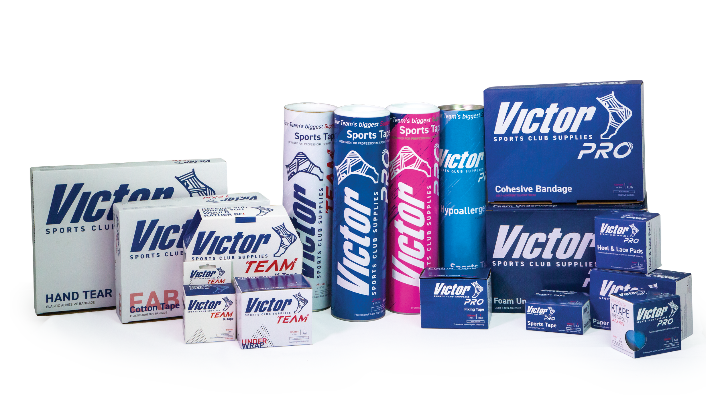
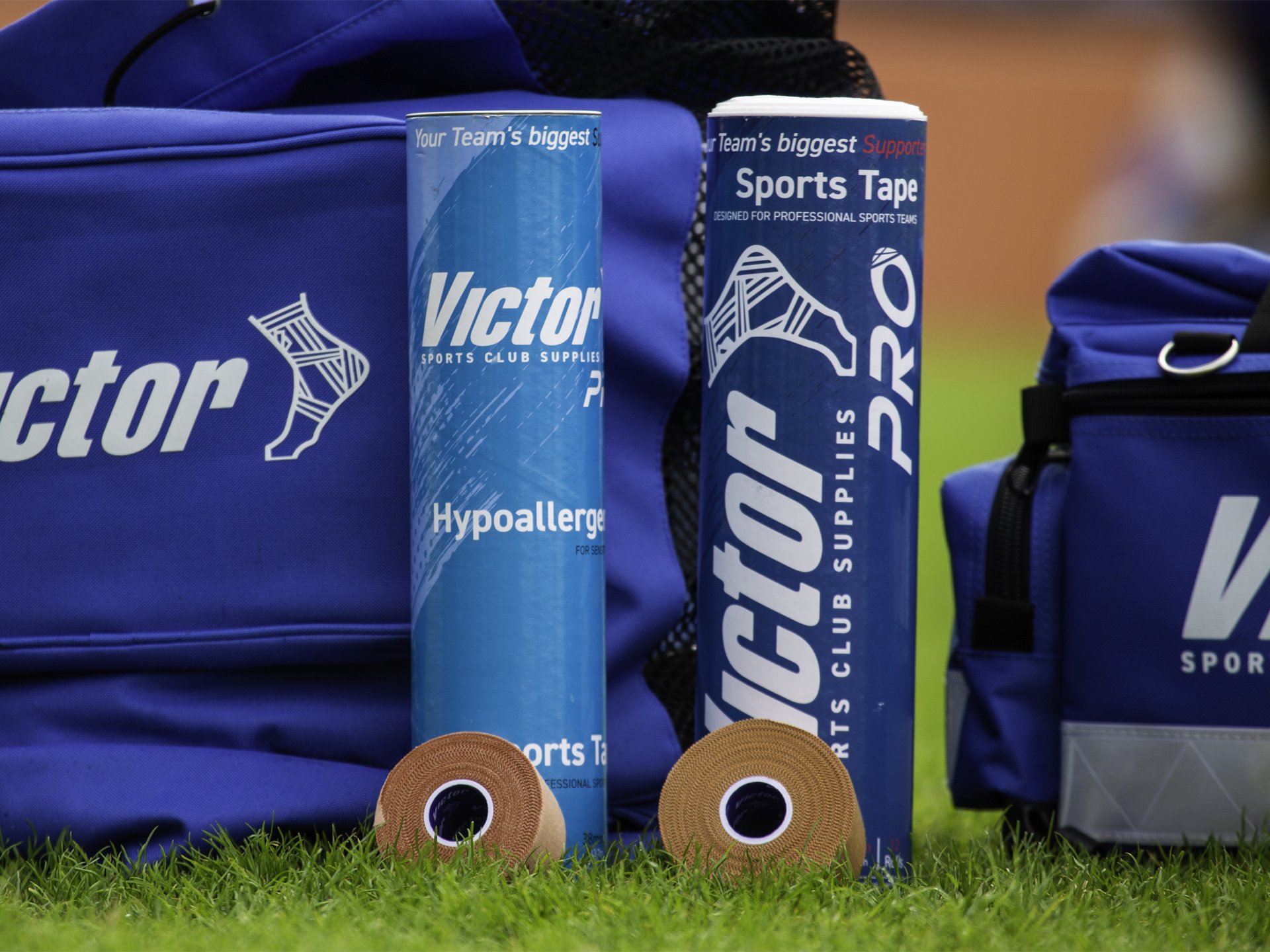
Updated packaging is made entirely from recycled materials, ensuring it is fully compostable and free of plastics.
Eco-friendly initiative minimizes waste and reflects a commitment to environmental responsibility.
Robust design prioritizes product protection, making the packaging durable enough for daily use, including transportation in sports bags.
Features a strong, rugged corrugated box with a matte soft-touch finish for enhanced durability and aesthetic appeal.
-
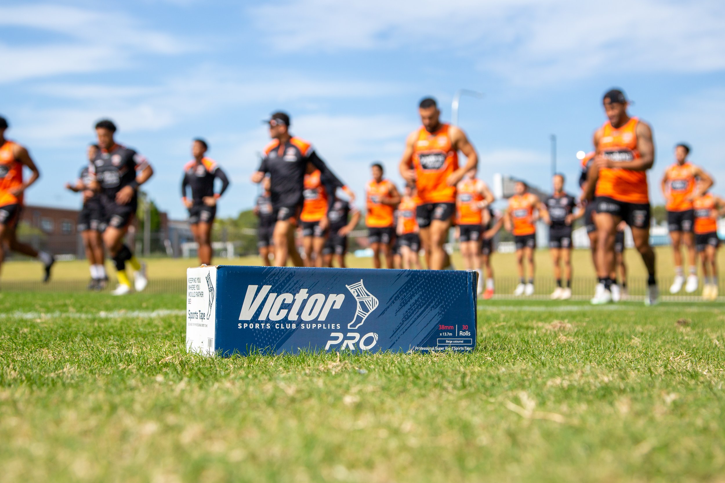
Comprehensive rebranding for product lines including Victor PRO, Victor TEAM, allcare, whiteley, 66fit, IDM Sports, Knight Sports, and maxiplast.
Bold and robust packaging and branding designed to resonate with the energetic gym and training environments.
Over 40 different items in each product line, indicating a major mass rebranding effort with multiple (3000) SKU variants.
Modernized product appearances aligned with contemporary athlete standards, featuring a distinct identity for each line within Victor's bold color scheme.
-
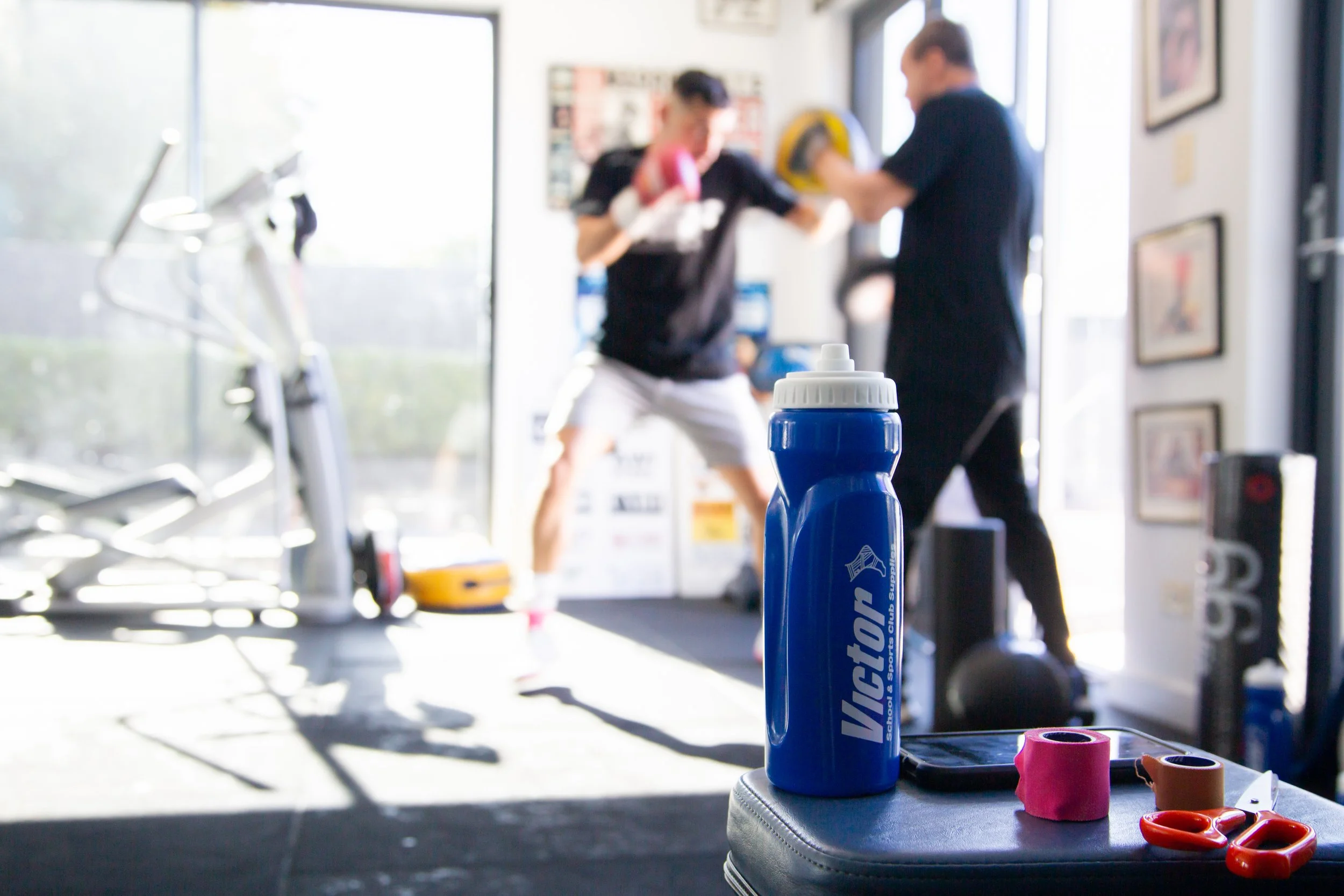
Each package is designed for ease of use in medical emergencies, ensuring quick access during critical situations.
The dispenser design was prioritised for optimal functionality and swift response times, enabling rapid use of the products.
Clear labeling and organization minimize confusion under pressure, enhancing efficiency when every second counts.
Containers are engineered for easy opening and dispensing, guaranteeing that essential items are readily accessible for immediate action.
Your one stop shop
〰️
Your one stop shop 〰️
Victor Sports Club Supplies
-
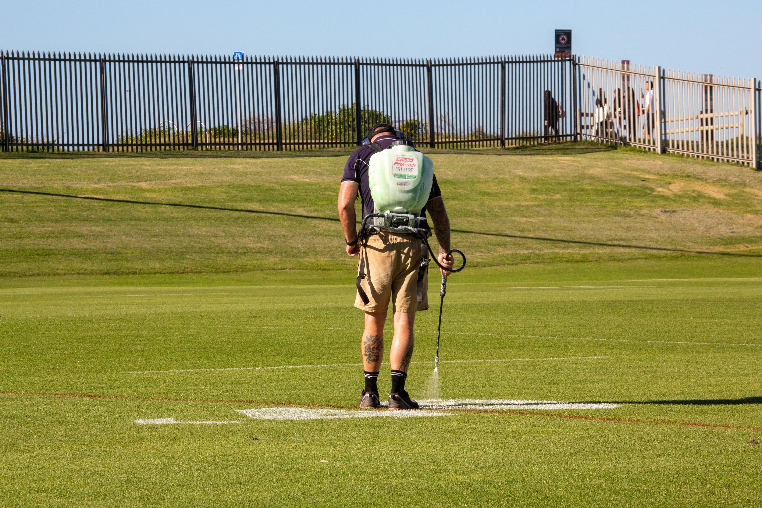
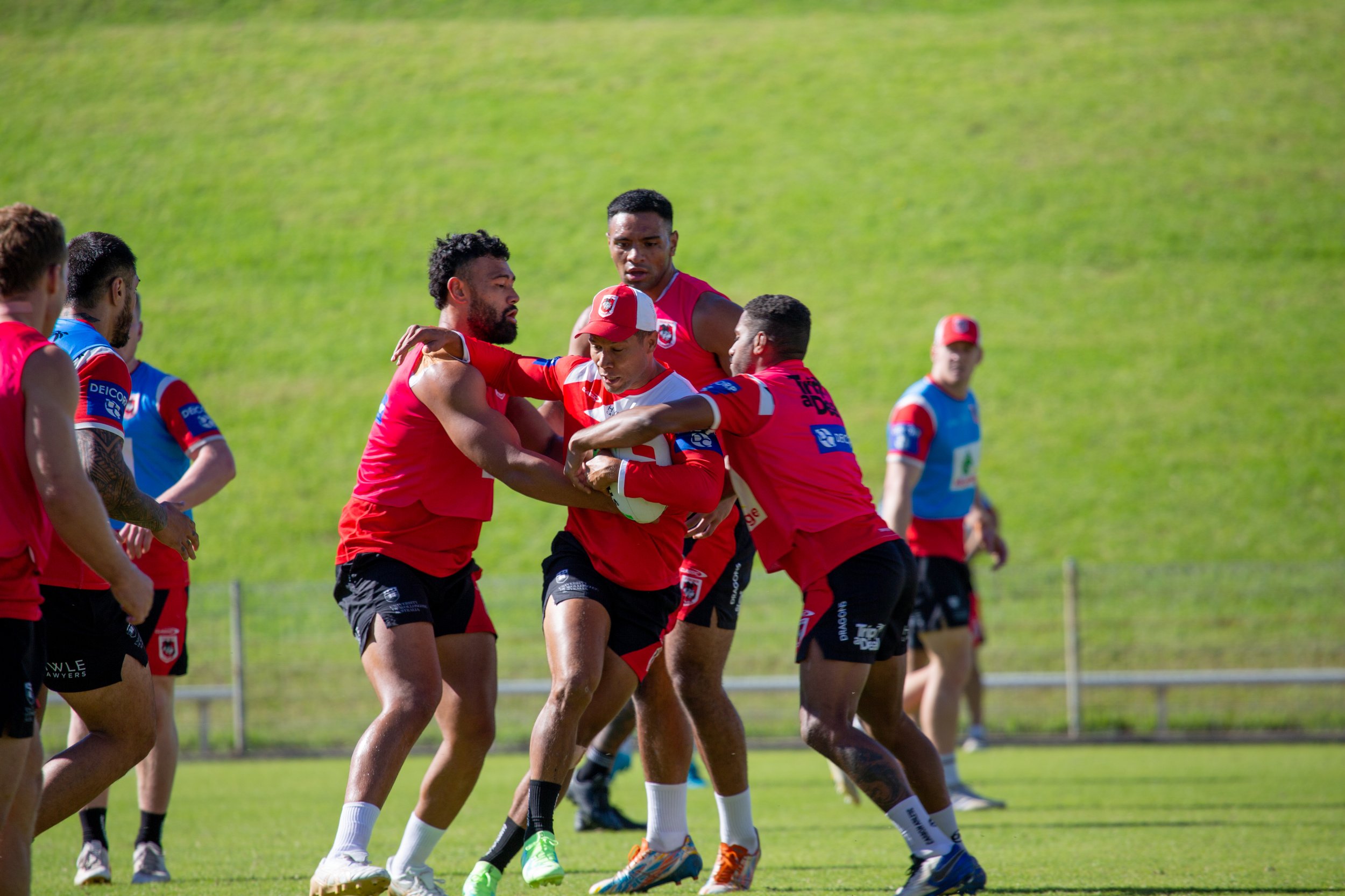
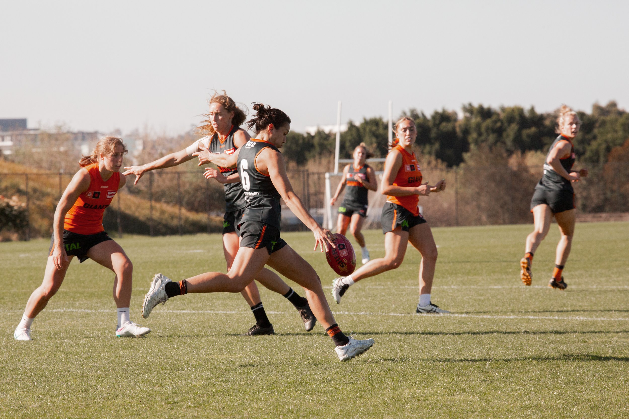
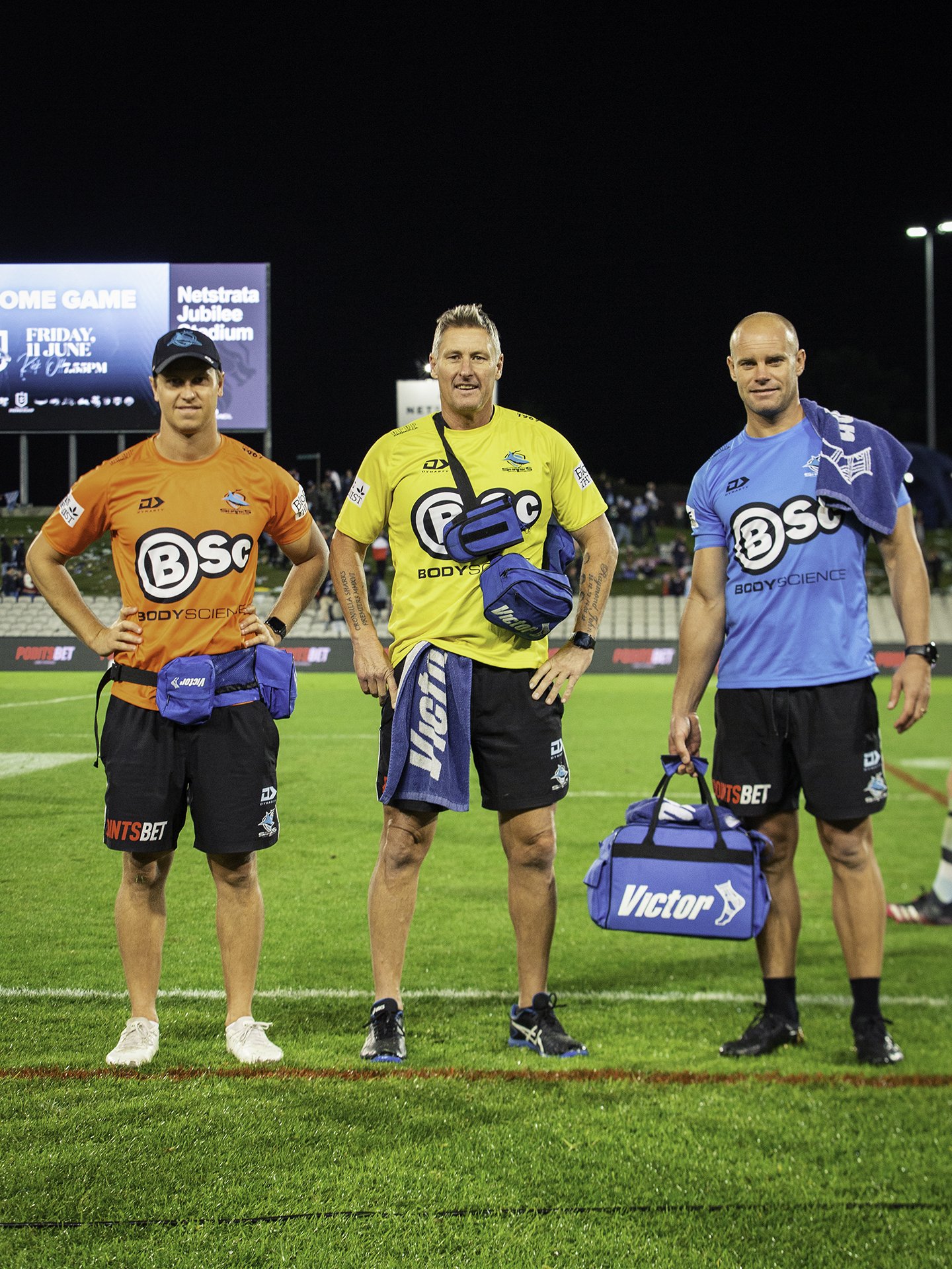
Engaged with the vibrant audience of Weekend Warriors, making Victor Sports an integral part of their sporting journey.
Targeted product placement through sponsorships of professional teams and local sporting clubs in Australia.
Aligning the brand with the energy and enthusiasm of team sports to
enhance visibility.Fostering connections with the community spirit and competition that characterizes dedicated athletes.
-
Victor Sports unifies diverse sports brands and products, serving everyone from professional trainers to casual athletes.
Clear branding for each product range helps athletes find tailored equipment and apparel.
Commitment to quality and innovation supports athletes at all levels in achieving their goals.
Victor Sports embodies the spirit of competition, providing accessible excellence for all athletes.

Whiteley Medical Supplies

-
Honoured long-standing client relationships while embracing growth and modernisation.
Redefined brand identity with a contemporary twist, maintaining the essence of the original image.
Updated colour palette and typography while preserving familiar design elements to avoid alienation of existing clientele.
Reinforced commitment to quality and service, enhancing client trust, loyalty and retention.
-
Established brands in the medical market are valued for their reliability and trustworthiness.
Our focus was on updating products to align with current industry standards.
Clarity and ease of use were prioritized to minimize confusion for healthcare professionals and patients.
Our messaging reflects a commitment to high-quality, dependable solutions that meet the expectations of the medical community.


66fit
-
Sourced eco-friendly materials for the 66fit Essence range to replace plastic, focusing on sustainable and biodegradable options suitable for the young fitness market.
Collaborated with a manufacturer to produce cork-based products that meet the design specifications of the 66fit Essence range.
Successfully developed a contemporary product line that is both ecologically responsible and appealing to socially and environmentally aware consumers.
-
The 66fit Essence range combines sustainability and functionality in healthcare and lifestyle products.
All products and packaging are made from biodegradable materials, such as cork and recycled cardboard.
The collection offers effective healthcare solutions while maintaining ecological responsibility.
Designed to promote personal health with an environmentally conscious mind.

Rebranded, remade & new dielines created.
Over 300 products
& over 3000 skus.


Website & Companion App Overhaul
In accordance with the new marketing strategy and re-branding of Victor and Whiteley, I designed and constructed a new website to not only improve user experience and create connectivity between the products but to ensure the target markets were being reached.
The old website was built using outdated Java script, which we updated to Shopify.
A contemporary website was established, which still permitted a connection to their stock system (ABM) for back-end usability. Regular audits and updates of digital assets were performed to ensure data integrity and optimise performance across all platforms.
Clear and efficient e-commerce was established to guide the company in the use and understanding of new tools.
PICK YOUR LEVEL
〰️
PICK YOUR LEVEL 〰️
victorsports.com.au
SEE HERE


wmedical.com.au
SEE HERE


66fit.com.au
SEE HERE


Creating a simpler way to shop, at your one stop shop.
-
Developed a modern logo for Victor Sports, reflecting its evolution since the early 1990s and appealing to a new clientele.
Updated typography to bold Sans Press and revised the colour palette for improved visibility across digital and television platforms.
Introduced “Victor Indigo Blue” and “Victor Team Red” to energize the brand and convey a contemporary identity.
IDM Sports & Maxiplast companies merged with Victor Sports. “School” was added to the logo to represent the newly acquired school sports market.
-
Whitley Medical Supplies, the parent company of Victor Sports, has a 30-year reputation for supplying essential medical products to healthcare professionals.
Following the merger with Victor Sports, a comprehensive redesign of the website and app was initiated to modernize brand identity.
Research emphasized the need to maintain familiarity for older clientele, prioritizing ease of use in the redesign process.
The new branding features a minimalistic, clean aesthetic with a refined logo and clear typography against a white background.
A curated color palette enhances the brand's minimalism while improving recognition, aiming to strengthen connections between consumers and health professionals.
-
Targeting the fitness and lifestyle markets, the 66fit Essence range is designed for socially and environmentally conscious consumers.
Modernizing the website and companion app ensures a user-friendly and cutting-edge online presence.
Enhancements align with the mission to provide eco-friendly, sustainable, and stylish products that resonate with contemporary values.
The revitalization efforts have resulted in a profitable and innovative product line that emphasizes ecological responsibility and modern aesthetics.

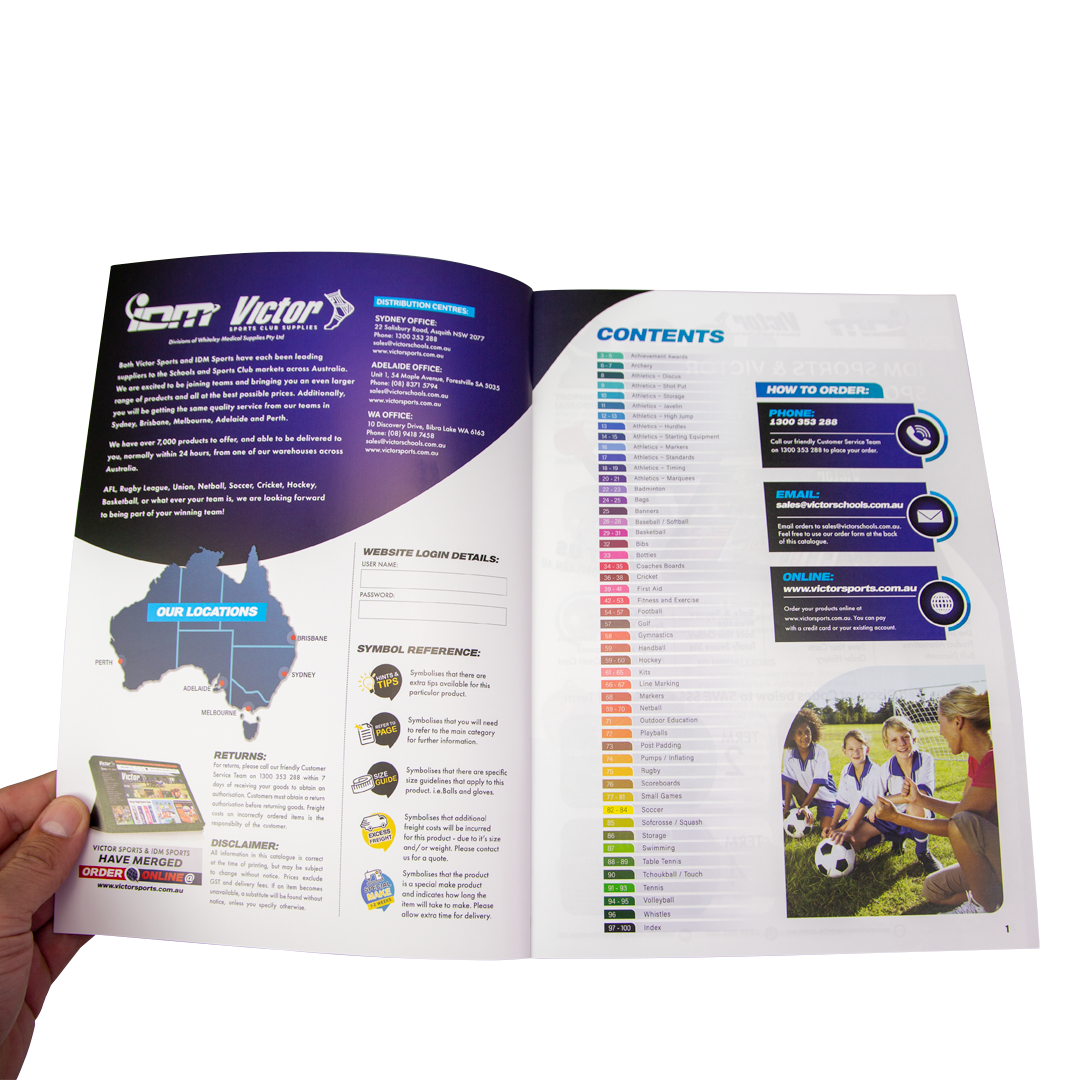
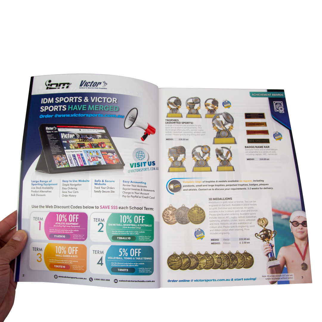
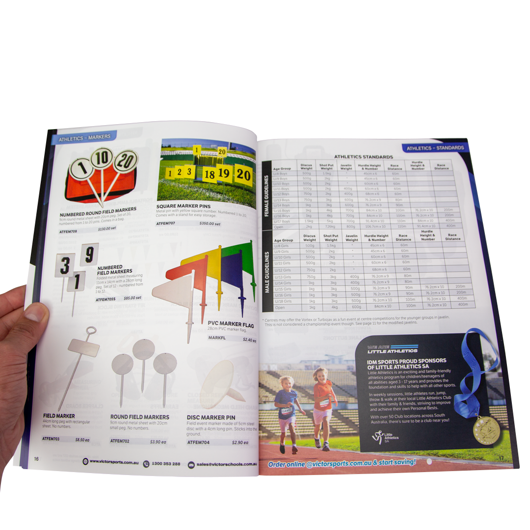
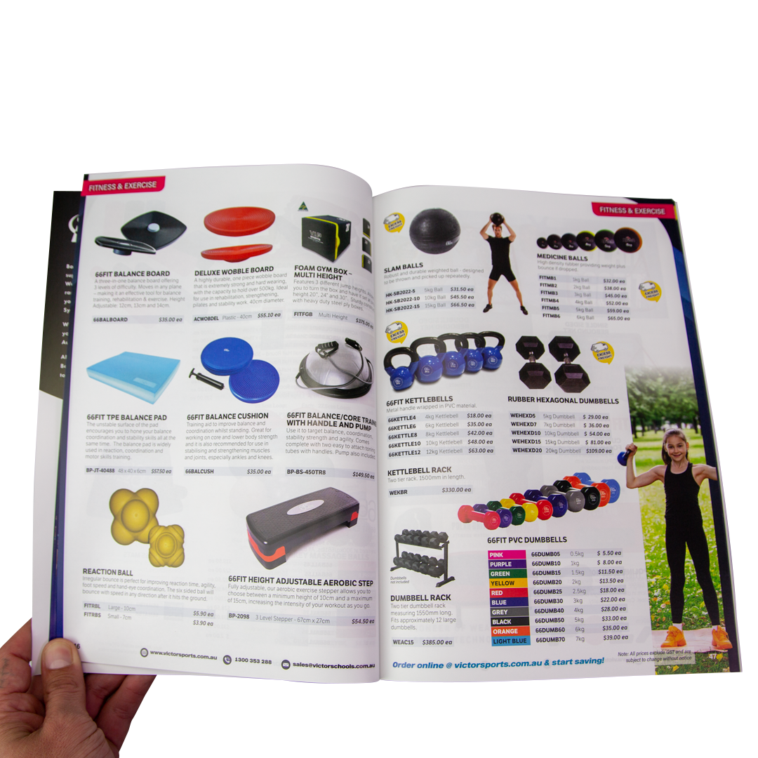
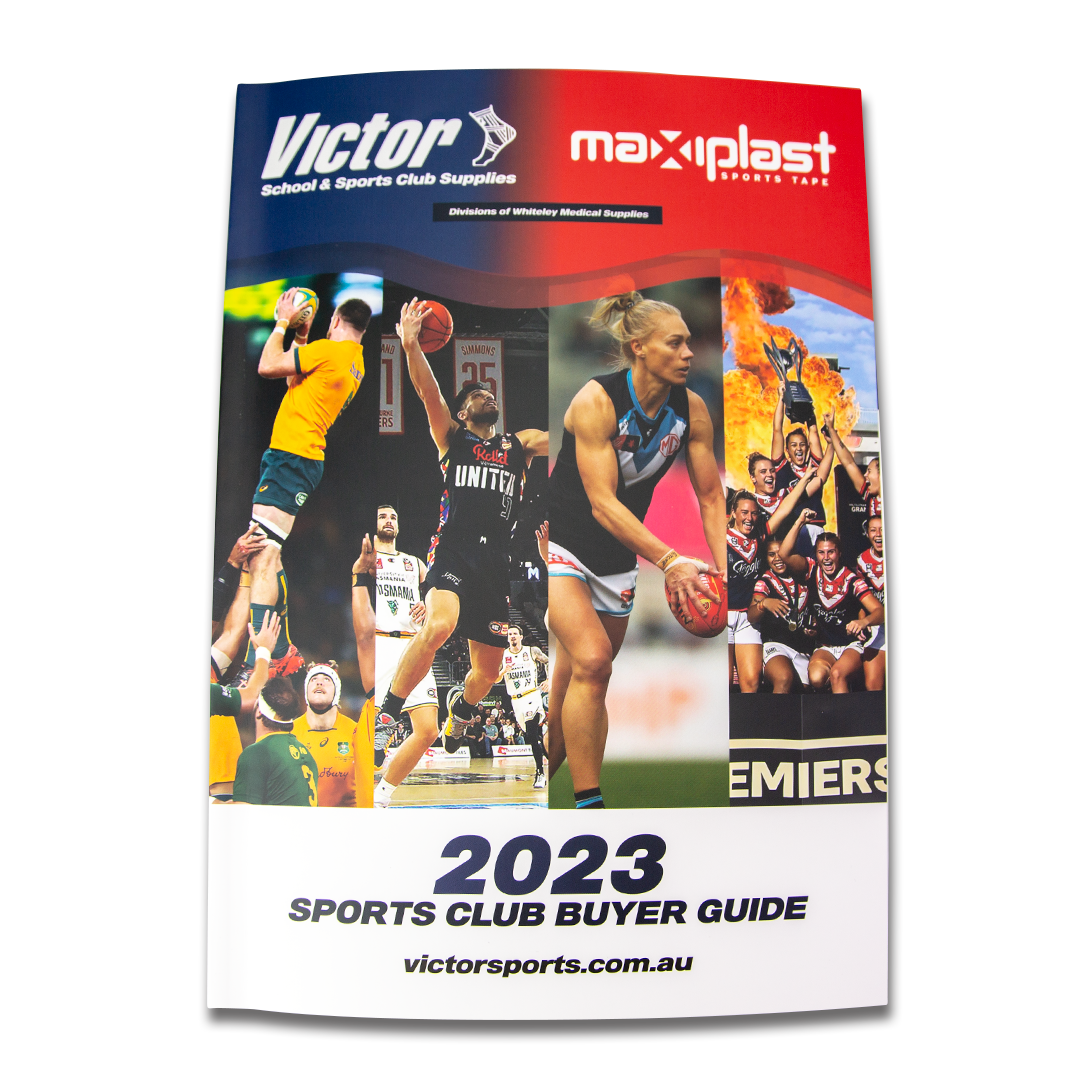
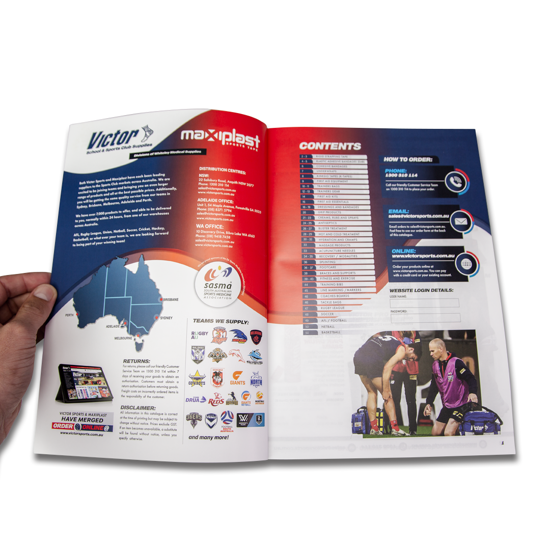
PUBLICATIONS
Mailers and publications were developed for Victor Sports, Whiteley Medical Supplies, and IDM Sports as collateral marketing materials. The content was tailored for medical professionals, featuring an engaging layout and clear, accessible language.
Publications
*
Publications *
-
A comprehensive resource for professional sports teams, featuring a detailed catalogue of high-quality equipment with specifications, innovative technologies, and competitive pricing.
Highlights the benefits of premium equipment for enhancing athlete performance and safety, supplemented by testimonials from industry professionals and expert reviews.
Aims to streamline the purchasing process for teams, ensuring access to the latest trends and tools necessary for success on the field.
-
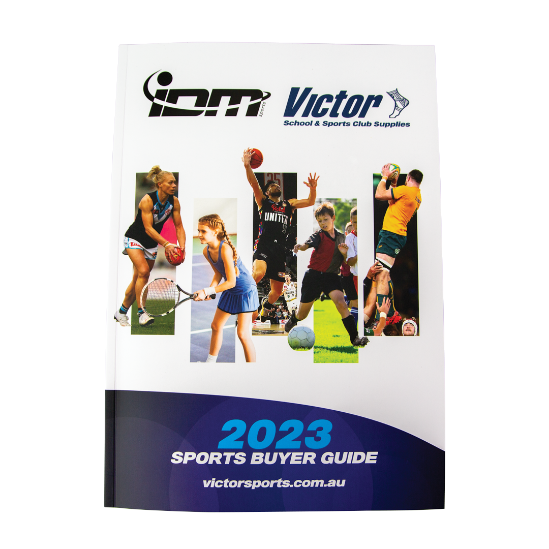
The “Sports Buyers Guide" assists schools in selecting appropriate sports equipment by offering thorough reviews, comparisons, and tailored recommendations.
The guide streamlines the equipment selection process, and emphasizes crucial information related to safety, durability, and budget considerations for educational institutions.
Targeted towards school administrators, educators, and coaches, it equips them with the necessary knowledge to make informed purchasing decisions.
“Marketing & products brochure sent to schools and
professional sport clubs throughout Australia.”
TV & DIGITAL
An essential component of the new marketing strategy was the development of marketing material tailored for TV and digital use. This initiative included the production of digital banners and collateral created for display on sideline TVs and jumbotrons, as well as for radio and TV advertisements. The cohesive design approach ensured that the material not only appealed to fans across various platforms but also integrated seamlessly into the national sporting arena.
The concept and design effectively captured the essence of Australian sport culture, emphasizing hero imagery and employing classic Australian idioms. This combination resonated with audiences, reinforcing the spirit of camaraderie and competition that defines sport in Australia. Leveraging these cultural elements served as a powerful tool to connect with fans and enhance the overall sporting experience on a national stage.
DIGITAL
〰️
DIGITAL 〰️
-
Launched comprehensive advertising campaigns for AFL and NRL markets to elevate brand presence.
Developed engaging radio broadcasts and captivating TV ads to promote new products.
Implemented a successful Email Direct Marketing (EDM) strategy for targeted outreach.
Adopted a multi-pronged 360 approach to address professional, local, and school markets with tailored messaging.
-
Implement a targeted marketing strategy that integrates products within local communities and with influential professionals.
Placed offerings strategically for firsthand experiences, fostering connection and familiarity.
Cultivated brand loyalty and established relationships with local figures aligned with our ethos.
Created strong brand recognition and emotional bonds through integrated digital campaigns, ensuring top-of-mind presence and community engagement.
AFL ad
Field Banner & Broadcast
An on-field banner & broadcast that would be played during the game on both during live TV & radio.
“KEEP YOU, WHERE YOU WOULD RATHER BE!”
FiBo Trainer
Directed filmed and edited.
A TV and online advertisment for the FiBo TRAINER, an easy to use full-body
workout tool.
“TRAIN, PLAY, ENGAGE”
subscriber count grew from Less than 1,000, with an open rate below 1%, to over 50,000 subscribers and an impressivE
open rate of 31%.
the click-through purchase rate Improved by a remarkable
increase of 300%.
EDM
〰️
EDM 〰️

Analysis of 2022 sales revealed the new EDM strategy brought in an additional $200,000 revenue
BRANDING
The merger of Victor Sports and Whiteley Medical required a comprehensive rebranding and an innovative marketing campaign. I successfully enhanced brand recognition while optimizing the user experience of their diverse range of products and services for various target audiences.
-
Victor Sports updated its logo to modernize the brand image for a changing clientele.
The original typography and color palette were replaced to enhance visibility and effectiveness across media.
Typography was upgraded to bold Sans Press, and a fresh color palette was introduced featuring “Victor Indigo Blue” and “Victor Team Red.”
The logo was further updated to include “School,” reflecting the merger with IDM Sports and Maxiplast and the expansion into the school sports market.
-
Internal and wholesale branding strategies were considered to maintain continuity with existing customers while updating the overall brand aesthetics.
A minimal and clean design approach was adopted, featuring a simplified logo and typography set against a white background, complemented by a modernized color palette.
Highlight colors were incorporated to establish brand recognition, with an emphasis on connecting professionals to products through effective brand awareness.
-
The 66fit Essence range emphasizes sustainability, targeting the socially and environmentally conscious young fitness market.
Focusse on innovative and modern styles that reflect ecological responsibility while maintaining aesthetic appeal.
Highlighted the commitment to both fitness and environmental well-being, reinforcing the product lineup's market positioning.
A new standard for eco-friendly products in the fitness industry was set, demonstrating a blend of sustainable practices and stylish design.

BUILT TO STAND OUT.
Designed specifically to command attention and to be clearly seen on a sports jersey from a variety of distances, while maintaining legibility.


BRAND RECOGNITION.
Maintaining brand recognition with
long-standing customers, with the intention
to attract new customers.
Minimal, clean geometry that refreshes the
pre-existing logo.

ECO-FRIENDLY.
66fit Essence - eco-friendly cork, biodegradable products.